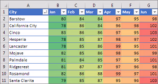
Conditional formatting is one of Excel’s most powerful yet underrated features. With just a few clicks, you can visually highlight key patterns, trends, and risks that might otherwise go unnoticed in rows of plain text.
Start by selecting your data, then go to Home → Conditional Formatting. From there, you can apply color scales to show highs and lows, data bars to compare values, or even icon sets like arrows, flags, or checkmarks for instant visual cues. For example, highlight overdue tasks in red, profit margins above 20% in green, or duplicate values with a bright yellow fill.
But the real power lies in custom rules. You can build logic-based formatting using formulas—for instance, highlight values above the average, mark cells containing a certain text, or flag dates falling within 7 days. It’s like adding visual intelligence to your worksheet.
Conditional formatting doesn’t just make your spreadsheet pretty—it makes it meaningful. When key information stands out at a glance, decisions become faster, reporting becomes clearer, and errors surface quickly. If you’re looking for a way to elevate your spreadsheet skills, this feature belongs at the top of your toolkit.
Here is a link to learn more about conditional formatting from Microsoft: https://support.microsoft.com/en-us/office/use-conditional-formatting-to-highlight-information-in-excel-fed60dfa-1d3f-4e13-9ecb-f1951ff89d7f